
Modern UI design demands not just beauty but also scalability, consistency, and development speed. That’s where atoms design systems come into play modular frameworks that simplify building scalable interfaces by breaking them into reusable components.
Why Modular Interfaces Matter in Modern Product Design
Modular interfaces provide the flexibility to scale without chaos. Designers and developers can mix and match pre-built components, ensuring faster delivery and more consistent experiences across platforms. When integrated with atoms design systems, modularity becomes the foundation for a rock-solid digital product.
What Are Atoms Design Systems?
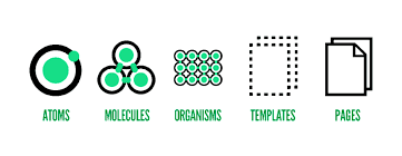
The term “atoms” originates from Atomic Design, a methodology introduced by Brad Frost. At its core, it breaks down UI into five stages:
- Atoms: Basic HTML elements like buttons, labels, inputs.
- Molecules: Groups of atoms functioning together (e.g., a search form).
- Organisms: Complex UI sections (e.g., navigation bars).
- Templates: Page-level wireframes of organisms.
- Pages: Final UI instances with real data.
This structured hierarchy makes atoms design systems perfect for managing design consistency across large-scale interfaces.
Benefits of Using Atoms Design Systems in Modular Interfaces
- Scalability: Easily add or remove UI blocks without breaking the system.
- Consistency: Shared components ensure a unified design language.
- Efficiency: Speeds up development through reusable elements.
- Collaboration: Designers and developers speak the same visual language.
- Maintainability: Update one component and reflect changes across all interfaces.
Core Principles of Building with Atoms Design Systems
Think Small First
Start designing from the atomic level. Nail down the colors, buttons, and fonts before combining them into molecules and organisms.
Component Naming Consistency
Maintain a clean naming convention so your design system is intuitive and scalable.
Leverage Tokens and Variables
Use design tokens for consistent spacing, colors, and typography across all modules.
Avoid Over-Nesting
Keep your component structure shallow and readable to avoid maintenance complexity.
How to Structure a Modular UI with Atoms Design Systems
| Level | Description | Example |
| Atoms | Single elements | Button, Label |
| Molecules | Functional groups of atoms | Input + Label |
| Organisms | Sections made of molecules | Header, Footer |
| Templates | Layout structure with placeholders | Blog layout |
| Pages | Templates with actual content | Blog post with real data |
This approach lets you build bottom-up with flexibility and clarity.
Use Case: A Modular Blog Interface Built with Atoms Design Systems
Imagine creating a blog platform. Instead of designing each page individually, break it down:
- Atoms: Headings, paragraph styles, buttons
- Molecules: Author info blocks, comment forms
- Organisms: Post header, post footer, sidebar
- Templates: Blog page layout
- Pages: “Latest Posts,” “Featured Post,” etc.
Each new post or section simply reuses existing components, reducing design work and development bugs.
Best Practices for Maintaining Atoms Design Systems
- Versioning Components: Keep track of updates with changelogs.
- Documentation: Maintain robust usage guides for each UI element.
- Visual Testing: Use tools like Storybook for real-time previewing.
- Feedback Loop: Continuously collect team feedback to improve.
Common Pitfalls When Building Modular Interfaces
- Over-Generalization: Trying to make one component fit too many use cases.
- Lack of Documentation: Teams misuse components or recreate existing ones.
- Neglecting Mobile-first Design: Design should adapt gracefully across screen sizes.
- Style Drift: Avoid updating parts of components without aligning with the overall system.
Real-World Tools That Power Atoms Design Systems
- Storybook: Visual testing of components in isolation
- Figma/Sketch: Designing components with atomic principles
- Zeroheight: Hosting living design documentation
- React/Vue: Component-based frontend frameworks
Integrating Atoms Design Systems in Agile Workflows
Embed your design system into your CI/CD pipeline. Use component-driven development in sprints to iterate UI in parallel with backend work. This leads to less rework and faster feedback cycles.
SEO Considerations for Modular Interfaces
Use semantic HTML and ARIA labels in your components. Ensure every element contributes to accessibility and discoverability, making your interface both user- and SEO-friendly.
Accessibility as a Pillar of Modular UI Design
All components must be designed with keyboard navigation, screen reader compatibility, and color contrast in mind. This boosts usability for all users and aligns with inclusive design principles.
The Role of Atoms Design Systems in UX Consistency
A coherent system builds user trust. Consistent headers, form behavior, and interaction patterns ensure users don’t have to relearn how your platform works on every page.
FAQs about Building Modular Interfaces with Atoms Design Systems
What is the main advantage of using atoms design systems?
They allow teams to build scalable, maintainable, and reusable UI components quickly and efficiently.
Are atoms design systems only for developers?
No. Designers, developers, and product managers all benefit from using and contributing to the design system.
How can I maintain consistency in a growing modular interface?
Establish naming conventions, documentation, and design tokens from the start and keep them updated.
Is it necessary to follow the Atomic Design model strictly?
Not always. It’s a guideline, not a rule. Use it to structure your system but adapt it to your project’s needs.
Can I use atoms design systems in mobile apps?
Absolutely. Component-based design systems are platform-agnostic and work well in both web and mobile.
How do I start implementing a modular UI approach?
Start with small, reusable components. Design and document them thoroughly, and gradually build larger structures.
Conclusion: Designing with Purpose and Precision
Building modular interfaces using atoms design systems ensures faster development, better user experience, and long-term scalability. By structuring your UI thoughtfully, adhering to best practices, and embracing a component-first mindset, your team will be equipped to deliver high-performing digital products consistently.
 Arabic
 French
 Spanish
 Portuguese
 Deutsch
 Turkish
 Dutch
Dutch
 Italiano
 Russian
 Romaian
 Portuguese (Brazil)
 Greek
Greek