
In a world bombarded by digital messages, tactile marketing methods like door hangers remain surprisingly effective. Their physical presence, ease of distribution, and ability to deliver hyper-localised messages directly to potential customers' homes make them a powerful yet often overlooked tool in the UK marketing toolkit. But what separates a door hanger that gets noticed from one that’s tossed away? The answer lies in design psychology.
Understanding how people perceive and respond to visual cues can help create door hangers that captivate attention and drive action. In this blog, we’ll explore the psychological principles that influence door hanger effectiveness, backed by real data, visual tools, and marketing best practices.
Why Door Hangers Still Work in the Digital Age
Digital fatigue is real. Consumers today are exposed to an average of over 5,000 ads per day across platforms. In contrast, printed materials—especially door hanger printing products—offer a tactile, distraction-free experience that’s both localised and memorable.
Door hangers have the added advantage of being placed directly at eye level on entryways—virtually impossible to miss. They're also more likely to be read because they stand alone, unlike leaflets buried among post or emails filtered to junk folders.
Grabbing Attention: How Design Psychology Works
The way the human brain is wired, data that is visual is processed rapidly. In line with studies, we make a first reaction in as little as 50 milliseconds. This makes the visual layout of a door hanger critical. Strategic use of contrast, colour, hierarchy, and spacing ensures the message is not just seen, but understood and remembered.
Visual Hierarchy and Design Triggers
| Element | Psychological Effect | Best Application |
| Bold Headlines | Directs eye to main message | Offer or Call-to-Action |
| High Contrast | Enhances visibility | Background vs. Text |
| Visual Icons | Emotional engagement | Reinforce offer visually |
| White Space | Reduces cognitive load | Makes reading easier |
Disclaimer: By using clear design hierarchy and prioritising readability, marketers can guide a viewer's eye in a logical, purposeful journey—from brand identity to final call to action.
Colour Psychology: Emotional Triggers in UK Audiences
Colours are not just aesthetic choices; they trigger specific emotions and associations. In the UK, colour preferences vary slightly from global trends, especially when trust and locality are at play.
Popular Colour Schemes in UK Campaigns
A survey conducted by the British Printing Industries Federation (BPIF) showed the following breakdown of preferred colour schemes for print marketing:
- Blue and grey: 35% (trust, professionalism)
- Red and yellow: 25% (urgency, attention)
- Green and white: 20% (freshness, eco-friendliness)
- Black and gold: 15% (luxury, exclusivity)
- Other combinations: 5%
Colour Usage Tip: If your campaign is based on urgency or limited-time deals, red or orange will likely outperform other palettes. For professional services or finance, blue and grey convey trust and reliability.
The Power of Messaging: What Words Work Best
Effective messaging leverages brevity, clarity, and relevance. A door hanger has limited space, so each word must work hard. Use short, benefit-driven sentences, and focus on addressing pain points or delivering clear incentives.
Top Messaging Techniques:
- Use of active voice (e.g. “Save 25% now” instead of “25% savings available”)
- Social proof (e.g. “Trusted by over 2,000 homeowners in your area”)
- Urgency triggers (e.g. “Offer ends Sunday”)
- Personalisation (e.g. “Dear Resident of Brighton…”)
Here’s a simple formula:
Headline + Value Proposition + Call-to-Action + Contact Info
“You’ve Been Selected! Enjoy 20% Off Local Window Cleaning – Book Before Friday.”
This line uses exclusivity, urgency, and a strong incentive—appealing to both logic and emotion.
Layout and Flow: Creating a Visual Journey
Most people read in predictable patterns—either F-shaped or Z-shaped layouts, depending on the language and format. In door hanger printing, this translates into guiding the viewer from top to bottom with natural flow.
Ideal Layout Structure
- Top Section: Brand Logo and Attention-Grabbing Headline
- Middle Section: Relevant Image and Offer
- Lower Section: Benefits in Bullet Points
- Bottom Section: Call-to-Action and Contact Details
This structure creates a logical path for the eye to follow, reducing cognitive effort and increasing the likelihood of engagement.
Localisation and Trust: Appealing to UK Sensibilities
Trust is everything, especially when engaging with households in local UK communities. A door hanger that feels impersonal or generic is likely to be dismissed. Including local references, community icons, or dialect-specific language makes a big difference.
According to research by Royal Mail MarketReach, 76% of UK consumers are more likely to respond to direct print campaigns that feature familiar locations or local dialect.
Trust Signals to Include:
- Local phone numbers or .co.uk websites
- Testimonials from nearby customers
- Use of QR codes linking to Google Reviews or service pages
- Map snippets or neighbourhood visuals
Common Mistakes to Avoid in Door Hanger Design
Design mistakes can undermine credibility or distract from the message. Here are some common pitfalls:
Design Dos and Don’ts
| Do | Don’t |
| Use high-contrast text and colours | Use hard-to-read fonts or light text |
| Keep messaging concise | Overcrowd the hanger with too much info |
| Include a strong CTA | Hide your CTA at the bottom in small text |
| Choose premium print finishes | Print on thin, easily damaged paper |
Disclaimer: Also, avoid vague messaging. Saying “Contact us for more info” is far less compelling than “Call now to claim your free quote by Friday!”
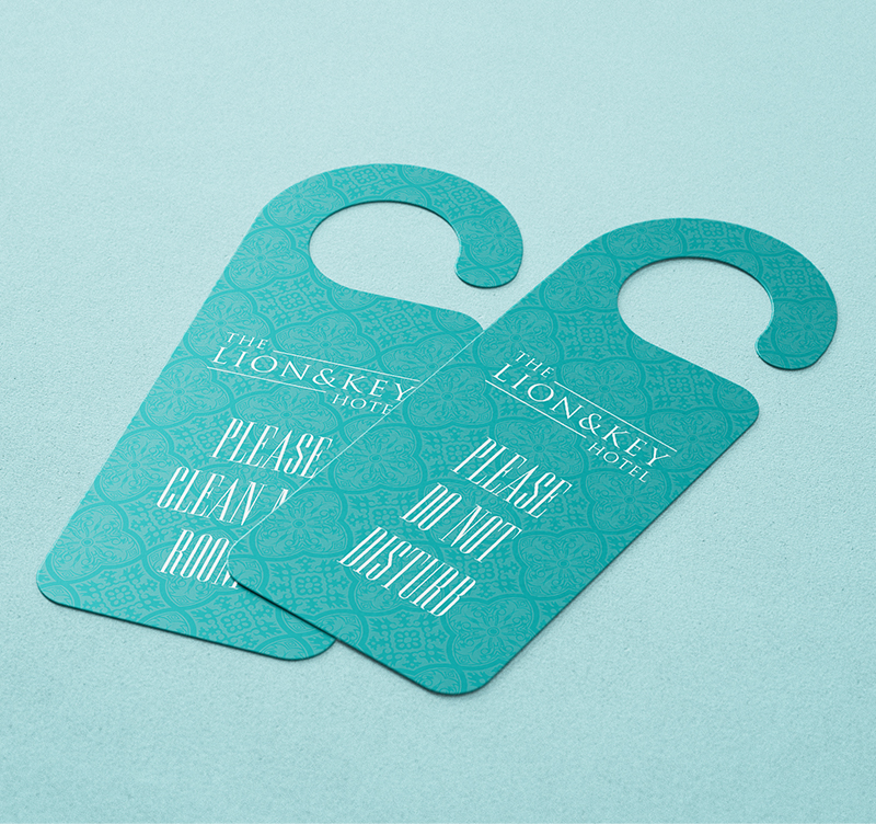
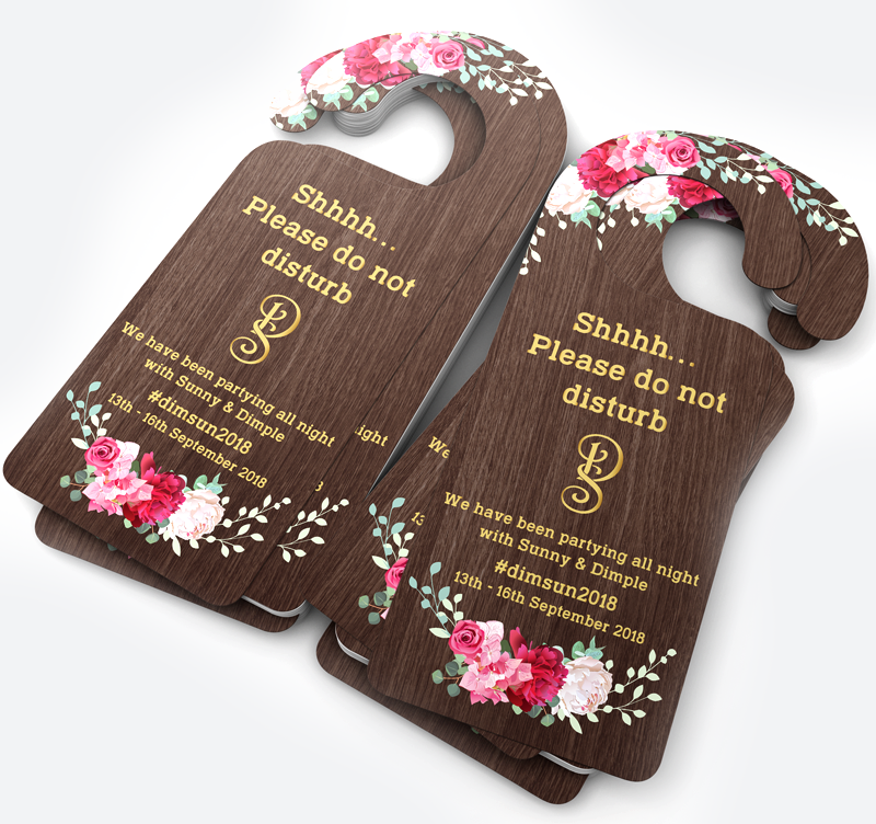
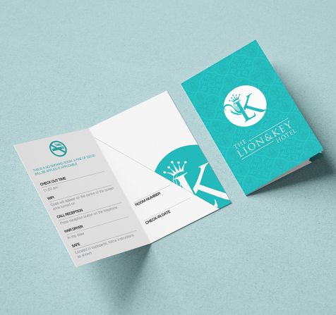
Door Hanger Printing vs. Other Print Tools
While door hangers offer unique advantages, they are most effective when integrated with other print materials such as flyers, business cards, or even key card holders—especially in hospitality or real estate settings.
Where They Fit Best:
- Local service promotions (plumbing, cleaning, window services)
- Hospitality industry (hotels, Airbnbs, serviced apartments)
- Political or community campaigns
- Real estate or property lettings
Pairing door hanger printing with branded key card holders enhances continuity in visual branding, especially in customer-facing businesses. These items act as physical reminders that reinforce your message and extend brand presence.
Conclusion
At VC Print, we recognise that the impact of a door hanger hinges on thoughtful design, superior print quality, and a deep understanding of customer needs. Serving the UK market, we offer a diverse range of premium materials and finishes, including custom die-cut shapes, lamination options, and embossing. Our door hangers are printed on 350gsm silk stock for durability and quality. Whether you're aiming to promote a local service or enhance your brand's visibility, our tailored solutions are designed to engage your audience effectively.